I think it’s time to do an S&P 500 report, the like of which I haven’t done in a long time. I think it will be a comprehensive report, especially by giving financial ratios, valuations, earnings and basic information.
S&P 500 General Evaluation
According to the PE ratio chart of the S&P 500, we are trading above the current bull market compared to historical averages:

I want to call attention to the dark patches that show recessionary periods. Recessions are usually accompanied by the lowest P/E ratios, which indicate favorable times to make investments. Nevertheless, despite this chance, a lot of investors give in to fear and sell their assets when the market is at its lowest point, which leads to large losses since they made rash judgments and didn’t have a well-thought-out investment plan. When a recession ends, P/E ratios return to the long-term average (as was the case in 2010 after the Lehman crisis) or even beat it by a standard deviation or two (as was the case with the strong recovery in 2020 during the Covid pandemic). Being on the buyer’s side would thus make more sense, particularly if the S&P 500 PE ratio—which is now 27—drops below 20. A PE ratio more than thirty indicates risky overvaluation.
Examining the Free Cash Flow Yield from 1995 to 2024 reveals significant market events:

When the Dotcom bubble burst in 2002, the Free Cash Flow Yield broke over 6% at the same time that the S&P 500 had its worst decline of 49%. After Lehman Brothers failed in September 2008, Warren Buffett made the famous declaration “Buy American. I Am.” in an op-ed piece published in the New York Times in October 2008, which coincided with a Free Cash Flow Yield of more than 10%. This crucial point emphasizes how important market valuation criteria are. During the worst of the global financial crisis in 2009, the Free Cash Flow Yield shot up to an all-time high of more than 13%, matching the highest drawdown of the S&P 500 at 56%. The turbulence of these times highlights the erratic nature of markets and the possibilities they offer. In 2020, during the Covid-19 epidemic, the Free Cash Flow Yield exceeded 6% once again, coinciding with the S&P 500’s highest drawdown of 34%. Introspection: Going through a 52% fall in 2009 taught me a lot about the value of investing in companies as opposed to just ticker symbols. This viewpoint completely changed the way I worked, making the future changes in the market seem irrelevant. A 6% free cash flow yield suggests that the market is a good place to purchase. A Free Cash Flow Yield of more than 10% is extremely uncommon—it happens maybe once or twice in a generation—and indicates excellent investment possibilities.
Since I have already covered the S&P 500 index as a whole, I will look closely at each stock that makes up and shapes the index in this section, one by one. Drawing the ratios on a distribution chart allows me to identify stocks that deviate from the average or median value, which is how I evaluate stock ratios and financials. Up or down, opportunities are represented by contrarian stocks.

The Price-Sales (P/S) multiplier is the main ratio I utilize. But it’s crucial, in my opinion, to contrast this ratio with projected income growth. When contrasted with anticipated revenue growth (2019 estimates), it offers a whole ‘Top-line’ viewpoint. The forward P/S multiple that the company is trading at in relation to anticipated sales growth is the main topic of discussion in this analysis. Generally speaking, investors want to purchase stocks at low multiples in comparison to high anticipated growth rates.


NVIDIA is a technological company with a fast growth rate and a PS that is remarkably high. The firm is expensive while having a strong sales growth outlook to support it. Apart from NVDA, I advise investors to exercise caution with SONY and TSLA as well. Apart from this, MMC’s low PS does not provide much of an opportunity because of its extremely poor revenue growth forecast. The uptrend’s technical deceleration appears to be a signal. Focusing on firms with low PS and strong revenue growth projections is therefore crucial.
Stocks in the energy industry provide excellent investment prospects. The performance of E and INVH stands out in terms of both revenue growth and PS. In particular, ENI is poised to break over the $33 resistance, having established a lovely ascending triangle in technical terms. As a result, I believe these stocks present an opportunity. It’s clear that GWW is overpriced from a technical and psychological standpoint. The sales indications are strengthened by the fact that revenue growth is now insufficient. Despite having a strong PS value, 3M has extremely poor revenue growth projections. Technically speaking, it has also continued to decline since 2018.


Within the financial industry, SAN stands out as a firm that has seen a decline since going public and is still losing money. As a result, it has been placed in the negative revenue growth part of this distribution chart. It shouldn’t be approached, in my opinion. Both CPRT and AMGN are expected to see exceptionally strong revenue growth, with an average PS value. As a result, I believe these stocks have excellent long-term prospects. The stocks of TFC and FTV appear to be stagnant. In addition, there are companies that have to be avoided because of PS and inadequate revenue growth.
Among stocks that rely on consumer demand, BSX is particularly overbought. Selling would have my support. Despite being on a long-term increasing trend, VMC’s expected revenue growth is appalling. As a result, I am not now looking forward to making long-term investments. At all, GS looks great.

A ‘bottom-line’ viewpoint is provided by the P/E multiple in combination with earnings/EPS growth (next year forecasts). The stock’s valuation in relation to anticipated earnings growth is reflected in the forward P/E multiple. Typically, investors who anticipate strong growth choose to purchase shares at a low multiple.
Based on my examination of the PE forecast to EPS growth ratio, I can conclude that Agilent is outperforming PSA in the energy sector. From a technical standpoint, Agilent Technologies is a rising wedge that I observe. In terms of real estate equities, I can declare that ZBH and NTAP are excellent investments, while CCI, MDB, and NXPI are poor choices. Of the financial stocks, TRGP and CSGP are somewhat good, while MBLY and OXY are the most ugly. Among technological equities, AMD and CDW appear favorable, while VALE, FWONA, and ADI are not.

From a ‘Cash Flow’ standpoint, the P/FCF (Price to Free Cash Flow) ratio provides information when compared to the FCF/Share (Free Cash Flow per Share) during the last twelve months. Understanding the P/FCF multiple at which a stock is traded in relation to its FCF/Share is necessary for interpretation. Generally speaking, investors like to buy equities at low multiples compared to high FCF/share.
Regretfully, TSM, TEAM, and MNST are not doing well when we look at the technology sector. Conversely, the equities IBKR, PINS, and WM seem to be excellent investments. Regarding energy, DUK appears to provide prospects. In terms of customer discretion, EBAY is unquestionably advantageous. There isn’t a stock in the financial industry right now that has a poor cash flow situation. In conclusion, when it comes to the health industry, I can state that UNH and REGN are doing well, but WST is not looking well.

Next, let’s look at the top mega market value stocks’ current PEG ratios. As you may have observed from the preceding sections, I believe that using sector averages and medians for analysis makes more sense than adhering to the conventional ratio guidelines. Due to the possibility of periodic changes in market dynamics and the fact that a stable approach does not always provide positive outcomes. I shall thus analyze the PEG ratio in this manner. Stocks below 1.00 in the PEG ratio are generally considered inexpensive, while those above 1.00 are considered expensive. However, as I’ve shown in other studies, I believe the best course of action is to search for extremes. Thus, I believe that concentrating on the companies with the greatest and lowest ratios produces better outcomes. This means that in addition to the value of 1.00, I will also consider the average value of 1.72.
With a consistent increasing trend since 2010, the PEG ratio indicates that MRK is currently cheap. In a similar vein, AMD, one of my preferred technology stocks, appears to be a very cheap company. Pepsi is one of the expensive stocks; I don’t think it competes well enough with Coca-Cola. In fact, AVGO is 2.63 points overpriced when it comes to tech companies. Since the top stocks—Google, Netflix, Qualcomm, and TSM—are at the index average, it is illogical for me to argue that they are overvalued, even if their prices are significantly higher than 1.00. To assert this, however, would be incorrect in the cases of Tesla, Apple, and Microsoft, as their values, at 2.3, are greater than the index average. I may thus conclude that they are overpriced. I ignore the PEG ratio figure while examining other indicators, even if Nvidia appears to be below average in this case.

My understanding of the sector’s stocks’ financial fragility is enhanced by the Piotroski F-Score examination. A low f-score suggests that there is vulnerability in the stock. Given this, it appears that TSLA and AVGO, which I do not think have a very strong PEG ratio, are quite flimsy financially. Conversely, financially robust technological businesses include Apple, Google, AMD, and Adobe.
The long-term trend of the Trailing 12-month EPS (earnings per share) indicates significant insights:

When the EPS approaches or surpasses the upper bound of its long-term trend, it frequently indicates overextension, which raises the possibility of a mean reversion. Recessions in 2000 and 2007 are two historical examples that eloquently demonstrate this phenomena. A similar opportunity for investing arises when the EPS drops below the trend’s lower bound, signaling undervaluation and presenting a good time to buy. We do not now find ourselves at either extreme, indicating a reasonable state of the market. This judgment is especially valid given that the earnings season is still in its infancy and might possibly evolve.
The S&P 500 corporations’ balance sheets are not feeling the effects of the interest rate hike cycle, which is almost ended and close to peaking. Although the total amount of debt remains low, many of these businesses have acquired financing at fixed rates. It is important to consider that net debt to earnings is now at historically low levels. The ratio of total debt to equity conveys a similar idea of strong balance sheets. The ratio of total debt to total assets also supports the story. Lastly, the same comforting message is conveyed by the Total Debt to Enterprise Value ratio.
Hard vs. soft economic data refers to basic indicators vs surveys and business cycle indicators. In general, which do you rely on the most? My perspective: In the medium to long term, real underlying data prevails, although short-term price changes are frequently influenced by emotion. Note that ‘The Ultimate Compilation of Sentiment Metrics for the Economy and the Stock Market’ is an ongoing project that will be delivered by 2024/2025 as a dashboard, framework, booklet, or other comparable format. The recent market boom has been fueled more by rising P/E multiples than by underlying fundamentals. Despite the swift and substantial gains seen at the start of the year, owing mostly to optimistic profit projections, market activity has now normalized, as is expected.
Regarding S&P 500 stock buybacks:
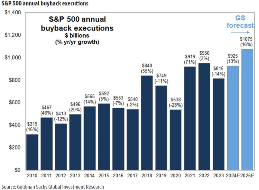
Following a dip in 2023, buybacks are expected to exceed 900 million in 2024 and $1 trillion by 2025. The ‘Magnificent 7’ corporations accounted for 26% of the index’s buybacks in 2023, with Q4 filings suggesting that they are presently permitted to repurchase $215 billion in stock, a 30% increase over the previous year’s authorization level during the same period.
The dividend yield has fallen to its lowest level as a result of massive repurchase operations, which began in 1982. When a firm pays dividends, it creates a taxable event for investors. Buybacks, on the other hand, provide flexibility; investors may basically make their own dividends at any time, avoiding immediate taxes if they choose not to sell their shares. Companies that systematically reduce their outstanding shares through buybacks, especially when values are low, increase shareholder value and outperform their competitors. During market crashes, recessions, and panics, a focused strategy on firms launching large-scale share repurchase schemes might be useful. Look for initiatives that go beyond cosmetic gestures or public relations methods to demonstrate a commitment to safeguarding shareholder value in the face of adverse economic conditions. Furthermore, organizations that continue or enhance regular dividend distributions during such times show better resilience and dedication to shareholders. During the Covid-19 epidemic in 2020, several exceptional enterprises used this dual strategy and performed admirably. This phase also provided an opportunity to purchase high-quality assets at a bargain.

Credit spreads are currently about 9-10%, which alleviates fears about corporate defaults. As a result, the S&P 500 index has risen to new highs in 2024, exceeding previous all-time highs set prior to the Russia-Ukraine conflict. Corporate earnings are expected to be strong this year, according to forecasts. Furthermore, the chance of a credit crisis in the near future remains low, despite the fact that we are still in a high-interest-rate environment. More information on this issue will be offered in my next report on the status of the US economy.
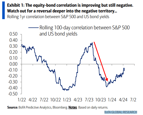
The correlation between the S&P 500 and US bond rates, which measures the equity-bond link, is improving, though it remains negative. Caution is urged, particularly given the possibility of a further plunge into negative territory. This phenomena illustrates a dynamic interaction impacted by current levels of inflation uncertainty or confidence.
It is widely held that the stock market, functioning as a leading indicator, predicts an upcoming recession by around six months. However, this assumption is not totally consistent with actual findings. According to research, 81% of the overall market value fall occurs during the recession itself, not in the six months preceding it. The comparison of the S&P 500 drawdown during recessions (shown by the dark blue bars) with the drawdown including the six-month period preceding the recession is an instructive exercise. It is worth emphasizing that the dataset covers nearly a century and includes a wide range of business cycles, making it a representative sample. Since WWII, there have been 12 recessions, with a 24% median market loss. While each recession and its accompanying market downturn is unique, a frequent finding is that stock markets bottom out and begin to rebound far before the recession’s official conclusion date.
During the catastrophic 2007-2009 Global Financial Crisis, individuals portfolios suffered losses of up to 52%. Despite the challenges, vital lessons were learnt, leading to a shift toward an entrepreneurial attitude that prioritizes long-term value creation above short-term market volatility. It is critical to understand that investment gains endure throughout time, aided by the compounding effect.
Despite severe drops, such as -32% during the 2020 Covid-induced depression and -36% in 2022, investors have showed the capacity to completely recover over time, highlighting financial markets’ intrinsic volatility and resilience. The analysis of intra-year falls and subsequent recovery in the S&P 500 highlights the significance of risk tolerance. With an average yearly drop of 14.2%, investors must be prepared to deal with market swings in order to continuously earn positive annual returns. Since 1980, positive yearly returns have been seen in 33 of 44 years, highlighting the need of keeping a long-term investing view and a robust portfolio structure.